Tuesday, 23 June 2015

Paint it Black (and Yellow); The reader experience of Randall by Jonathan Gibbs


I have absolutely no recollection of what led me to put Randall by Jonathan Gibbs on my Christmas list. So when I got round to reading it, come Easter, it was with no preconceptions whatsoever bar "at some point I must have liked the idea of this one ..."

I'm preoccupied with "reader experience" at the moment; how we live with and use a book, what our relationship with it is like as an artifact, not just a text.

The text in this case is fantastic, by the way, but this isn't a review. Instead, here goes with my reader experience of Randall:

Black cover, austere, bold type, a tiny splash of colour but no pictures. That all says to me "this is a sharp, clever book". Not exactly inviting, but definitely cool.

An extract from the book on the cover: "People were sobbing and cowering. A man's voice, plummy and shrill, was repeating 'It's just paint! It's just paint!' over and over." You physically can't avoid seeing that several times as you read the book. It influences your expectations. I knew that there was a moment of crisis in the book and that it was of pivotal importance. I was anticipating it until it happened and I had an awareness of its centrality as I was reading it.

The endpapers (and that little splash of colour on the cover) aren't randomly selected. The book is about an artist who at one point invents his own colour - Randall Yellow - and uses it as a personal brand. From that point onwards, the endpapers are promoted from just a nice design touch to being an integral and witty part of the book.

The author biog is another feature you naturally look at a lot when reading this book. It's on the back flap so you naturally use it as a bookmark (at least I did). It's pretty sparse. Literary authors often have this minimal sort of bio. Seems a shame, if you ask me.

In place of a conventional author photo we have an abstract (yellow) paint splash. God knows what it signifies*. Our visual acquaintanceship with the author is deliberately denied. That pissed me off a bit too. Perhaps it should be irrelevant, but I always want to know what the author looks like. In this case perhaps it was decided that it would be a distraction or something.

Overall, though, the fact that this distinctive and clever book was published in a distinctive and clever way definitely strengthened my attachment to it as I was reading it - I was fascinated by the thing as well as the words - and made me want to champion it widely. Which I have.

Reader experience in action.


*postscript: I have just had it explained to me what it signifies and I now feel verrrrry dense not to have clocked it.

Friday, 19 June 2015

Who Are All These People? The Reader Experience of Bring Up the Bodies on Kindle


Having adored Wolf Hall like any other right-thinking reader, I started reading Bring Up the Bodies with real excitement. A curious thing happened, though, due to the fact that this time I was reading a Kindle edition.
After a few chapters (or a few %) I began to feel frustrated that I wasn’t able to refer to a list of characters - an invaluable help to a sieve-head like me - as I had when I read the hardback of Wolf Hall. I emailed customer services at HarperCollins to ask them if they’d kindly email me the cast list. They sweetly emailed back saying “the cast list IS in the Kindle edition, but it (the ebook) defaults to starting you at page one of chapter one - you need to find it via the main menu of the book”. I blush at the memory. I felt so stupid for not having checked. But then ... why the hell would I? Or anyone?
That’s a poor Reader Experience (or RX if we’re being pretentious, which I am).
For all their convenience and speed, there are some things that don’t automatically work well in ebook format. Some are set by the ebook retailer - a whole can of worms in itself. Some are unavoidable – reference books are barely worth the bother because navigation is so much slower than a physical edition, or the internet. But some can be solved with care and attention. Is there a picture section stuck at the end? (which, in a physical book, would be an immediately obvious plate section) If so, why not say so at the beginning so at least we know we can take a look before we finish reading, when those pictures might be more relevant? Are there maps? If so, where? Please tell us in good time. And please let those maps render legibly on all reasonable devices.
Who wrote this long introduction or preface that I’m wading through? It’s useful to know yet requires a fair bit of thumb-work on an electronic device to find out, unless it says "introduction by X " at the start. It’s quicker to find out in a physical book because we’ve been practicing flicking through them all our lives, so we do it almost subconsciously.
These are tiny refinements to the Reader Experience, but ask yourself if you’re content to leave them undone. After all, what is a publisher for if not perfecting and providing the things that readers read? What readers are actually buying is subtly different from simply “a text” as anyone who’s read a £1 classic and wished they’d splashed out on the Penguin will know.
I suspect part of the problem is that, as publishers, we’ve got quite a lot on. By the time the finished text has gone to your ebook conversion house, or your xml system has spat it out, the editors responsible will have moved on to the next title and the next deadline. So perhaps don’t just leave it to editors. Have a group of people in your company, of whatever department, to be "mystery shoppers". Ask them to buy some of your key backlist books in ebook form and read them … or just start reading them, as if they were civilians. See what happens. If you can improve on the experience they have - the RX - you’ll improve sales.

Maybe you won’t improve sales much, but since online recommendation is such a vital driver of backlist sales now, don’t you think half a percent’s improvement over your whole backlist, over the next few years … is worth trying for?

Sunday, 2 November 2014

The Great Boffo

I blogged on Velominati.com about Frank Dickens' peerless The Great Boffo.

I'm researching bringing this book back into print with the cooperation of Frank's daughter Julia. The economics are challenging but all the necessary tools exist: digital printing, streamlined bibliographic data handling, distribution (albeit fairly restricted; wholesalers and Amazon). So it might work out.

It's a sentimental mission - my dad used to read me Boffo when I was young - and an entrepreneurial one too; I'm certain there's a market for it.

We shall see …


Friday, 6 December 2013

Five Reasons Why My Bike Is Best

Picking up your new dream bike is a serious matter, evidently.


#1 I know who made it

A nice young chap called Joe, as a matter of fact. I say "chap" but of course I mean "welding ninja". Titanium framed bikes are relatively scarce partly because to get the bits to stick together you need to weld them while they're bathed in argon gas. A job for the intern? I think not. Joe works at Enigma, a specialist bike manufacturer in Sussex. Without getting too farmers' market-y and artisanal about it I am very attracted to the romantic notion of the expert bike builder. Joe is the one in the grey hoodie in the photo. The other guys - whose names escape me, cut the tubes and finished the bike. Chapeau to them all. Apologies for the garish purple test saddle by the way - the real one will be black.

Creators and new owner, all doing well


#2 It cannot be harmed by conventional weapons

Titanium is good for bike construction because it's light and strong. In recent years, carbon fibre has become de rigeur because it's even lighter. But it's not stronger. I know people whose chainstays have snapped and whose top tubes have cracked. Screw that. Titanium, let's not forget, also gets used to armour plate things. It lasts practically for ever, and it doesn't rust. 


#3  It Is Shiny Like a 1960s Fighter Jet

Because it doesn't rust, you don't need to paint a titanium frame. Thus while everyone else is doing the dull black thing, or the gaudy graphics thing (is there a less impressive field of graphic design than bike frames? Yes, cricket bats, but anyway) you can flaunt the difference of your machine by showing off the naked metal.

Shiny. Not flashy.


# 4 It is unique

Unlike the M14s in Full Metal Jacket ("there are many others like it but this is mine"), there actually aren't many, or any, others like it. The frame was designed to my measurements by another ninja at Enigma - Mark.

#5 It has a Chris King headset

I love a specialist. Chris King make wheel hubs and they make headsets. Theirs are the best. Why? Aaaaah not quite sure (smooth and durable I think). Everyone says they're the best, anyway. And they look really smart. Turns out they do headsets in titanium. Soooooold.


My bike: it's the best.

Friday, 5 October 2012

Printing a Bookplate

I was commissioned by an old friend, C, to make an 'ex libris' bookplate for her husband, J. Her brief was pretty detailed:

  • In the style of Eric Gill, because her husband, like all right thinking people, is a massive fan (despite the dog-bothering and so on)
  • Featuring a quote from Samuel Beckett, another hero of his: "I know what the words know"
  • Depicting a pohutukawa tree, from his native New Zealand
  • And depicting his whole family.

That's some kitchen sink brief, but I like a challenge.

My source material included a book of Gill prints, featuring this little cracker:


Google images of the pohutukawa tree:


... and my own memory of the back of J's head and those of his family. I don't really do faces (too difficult), but fortunately, J's family have properly distinctive hairdos.

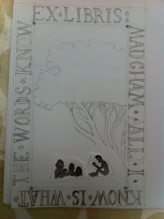
Stage one:

A massive ripoff of the Gill type style. I particularly like the little diamonds to separate words


Stage two

Tree and family added


Absolutely MASSIVE cockup averted here when C asked that J could join in the family group rather than sit alone, as though in some righteous dadly huff. If she noticed that I'd witlessly copied the Kindle logo she was good enough not to say, but it was a good save in any case.


She also correctly pointed out that J looked a bit Sideshow Bob. Now his hair really IS that big, but on balance his feet probably aren't a yard long, so I had another go.

Stage three

The final, un-Simpsons sketch was transferred by The Magic Primary School Tracing Paper Method to a sheet of lino.


Stage Four

I gouged the lino block


... and printed it. Early versions were a bit rough


... but I got there in the end. The fine folks at Marstan Press printed a few hundred on sticky backed matt stock, and the deed was done.


Monday, 2 July 2012

Under the Hood - Creative Transparency in Publishing

This is a (rather long) version of a talk I gave at the recent Bookseller Creativity Conference.


There are many problems that loom over publishers these days. Among the loomiest - and most familiar - are these two:

‘How do we talk directly to readers?’

‘How do we show that we matter?’

We worry that traditional retail and traditional media are both declining, so if we want to get our products noticed by people, we can’t rely on others to do it for us. Most publishers are already talking to readers direct; but most want to do it more often, and better, and more quickly.

And in a world of easy self-publishing and agents with disintermediation on their minds, we publishers feel a pressing need to demonstrate to the world what exactly it is that we do that’s so excellent and so worthwhile.

I have a suggestion that might help answer both of these questions: allow the public to see more of what we do.

Not allow them to do what we do: this is not crowdsourcing, in fact it's the exact opposite. It's about presenting ourselves as experts. Interesting, trustworthy partners with our authors in the wonderful process that makes good reading... good.

Of course I’m not proposing that we lay open everything we do to the gaze of Johnny Public. Some of it’s too secret. Some of it - with the greatest of respect to our Bought Ledger department - is too dull. Some of it’s both.

Sometimes, clearly, opening things up to the public is inappropriate. If you’ve just spent a quazillion pounds poaching James Patterson, you’re going to want to look infallible. You don’t want to see staff over-sharing about the work on Twitter: 

“Totes out of ideas for J-Patz cover!! All these ones are rank!! ROFL”.

But that’s not a typical scenario. What’s much more typical is a brand new author or book which you have to launch from nothing, and frankly anything that gets the public engaged with it and curious about it is worth considering. Particularly if that thing might represent better value than the four-sheet posters you might otherwise be forced to do.

So how would this work, practically? How would we interest people and demonstrate our value by opening up our processes? Fortunately some publishers are doing fantastic work in this area already, and we can learn/steal from them.

Penguin do creative transparency very well.  Their website features lots of excellent videos of designers talking about how they made their covers, along with editors, copywriters (or “blurbistes”) and others.

My favourite is actually quite an old one. It’s Coralie Bickford Smith talking about designing the Gothic Horror novels in the Red Classics series.


It eschews slickness in favour of wit and honesty, and is very, very charming as a result. And it makes you want to own those books. It dramatises the creative process, shows you what care and cleverness went into it. So it helps you realise that the books are worth buying, at a premium price.

And the buying bit is key: this is not just done for fun It’s done to engage readers and also to show our value, so that the reader engagement turns into sales and the demonstration of worth results in good acquisitions.

When the BBC wanted to build on the success of the series Luther, their main tactic was to stoke expectation for the second series using a very cool website. It worked brilliantly - the site was visited by hundreds of thousands and the second series was much bigger than the first. But the website feature that kicked it off was simply a picture of the first page of the script. Massive response.

And this was an idea that Penguin learned from/stole/just coincidentally came up with on their own: when they posted a picture of the first page of the new Zadie Smith manuscript on their fiction blog they got 2,500 views in a day.

Keen readers, the people who pay our wages, tend to be interested in the creative and curatorial processes we undertake. I have found this out visiting three book groups a year, routinely. They all love seeing our book proofs, seeing the cover visuals that we didn’t use, and hearing the story of how a book came to be the success it was..

More examples: Orbit’s Lauren Panepinto posted a video ages showing a speeded-up screengrab of her designing the cover of a fantasy novel called Blameless.


Publishers, traditionally, are homework-hiders. We say ‘it’s all about the books’ partly because we’re scared of pushing ourselves forward and being judged.

But not in this video. It has a big mistake in it. But no one would get to the end bit of that video and think “durr, stupid publishers” because they’re too busy being impressed by the design skills on display. So the bit where the Eiffel Tower appears a few decades early is funny, and it’s human, and it goes to emphasise the excellence of everything else. It might not even be a  particularly unique cover, but having watched the process I kind of love it, and I’d recognise it if I saw it again.

Another example of exposing the publishing process comes from Osprey, who are way ahead of most in their direct communication with readers. They post things like this on their blog:


It’s really straightforward. It’s just saying “we’re really excited about our new book on the Great Lakes Warships—” (aren’t we all?)  “—here are some draft sketches from the book in progress”. That’s it. The fans love it because they get to anticipate the new book and get a frisson of behind the scenes-ness. The team at Osprey get to remind us that they’re involved in actually making the thing.

Here’s one of the reader comments this post generated:

“Thanks for sharing. They look great. Illustrations like these show why Osprey’s still the best at what they do.”

The amount of reader interaction Osprey get is huge. If they tweet about cake in the office, followers will ask ‘whose birthday is it??’ But lest we write those followers off as “nerdy military history stalker types”, consider that large numbers of them subscribe to the publisher’s membership scheme for a monthly fee, so they can buy books direct from them at a discount. Significant direct sales, month in, month out.

A couple of other examples. Mills and Boon have started doing Google hangouts where the editor and author talk together about the books together. And Penguin often get editors and authors on stage together at literary festivals, also talking about the books almost as partners.

My lot, Hodder & Stoughton, recently helped our author Lindsey Davis tell part of the story of the creation of her book Master and God. Lindsey writes an excellent newsletter for her readers, which we print for her, and there was a feature in the most recent one about the new book cover. 

 
It begins “I prepared a brief which said “the themes are paranoia, survival through friendship and love and corruption as signalled by the leitmotif of a fly. I admit paranoia must be awkward to draw”.
She goes on to describe the back and forth of the creative negotiation that led to the cover. Her inspirations, the designer’s response, her feedback. The photographer, it turns out, auditioned several fake dead flies before finding a real dead fly who was perfect.

She ends on “I just thought my readers would like to know that”.

So, we can make videos about the creative process, we can blog work in progress, we can enlist the author to talk about their interaction with the publishing team. All interesting, all involving, all - if you’ll forgive the verbcrime – ‘surfacing the value add’.

What else can we try to take this further?

Anyone who’s ever been to a digital innovation conference will have seen the video showing how they made the Sony Bravia TV ad. The ad featured thousands of colourful bouncy balls bouncing down the streets of San Francisco. I’m sure I’m not alone in being more entertained by the footage of the guys filling massive air cannons full of bouncy balls at dawn than in the ad itself.


So, book marketers next time  someone comes up to you and says “can we do a trailer for this novel? Something really filmic, yeah?”: do it, but consider also shooting a little homemade documentary of the process of making that trailer. Talk about what you’re trying to say about the book. Why you love it and what you’re trying to convey about it. Talk about the choices you make and the ideas you didn’t use.

Also: the next time your author, or an actor, is recording an audio book, why not try videoing that, to show how that fascinating process works? Not so much the technical aspect, but artistically.

Another thought: People who write copy do a very creative job. An undervalued one, as I seem to have insisted before.

Say you had a week to write the best possible blurb for your new literary smash. What would happen if you committed to blogging a draft of it every day of that week, with a short explanation of why you’re trying this approach, what aspect of the work you’re focussing on... and inviting comment on whether it works?

The ultimate laying open of the publishing process would of course be to put a manuscript online, complete with the author’s and editor’s comments and changes, or all to see. Most authors would loathe this idea, and most editors too. But don’t assume it’ll never happen. I bet there are authors who would do it. And if an author is happy to reveal that process of mediation and refinement in which the editor is a vital partner, then why wouldn’t the editor in question be up for it too? “Because it’s weird!” I know. But still.

I’d like to emphasise at this point that I do recognise that all of those ideas represent hours of work and effort, some of it quite uncomfortable. And no one has spare time on their hands. But I would urge you to consider the strategic importance of communicating interestingly, direct to readers, and demonstrating the worth of publishers. Keen readers are interested in this stuff, as we’ve seen. So let’s make use of that interest.

Think about the big book for next spring you’re most passionate about as a company. The one about which you’re saying, “We’ve got to do everything for it. Like When God Was a Rabbit. Like The Passage.”. Then imagine you decided to tell the story of that publication as it’s happening. How well would you come across as a company, as a group of committed, creative people? How great would the book look? 

Challenge your corporate reticence. Be proud. Find clever ways to show the world the creative role you play in the life of bestselling books. It’s not about shouting about your results, it’s about revealing your expertise.

Thursday, 10 May 2012

Guest Post: Jamie d'Ath of The Unsamaritans Book Club

Venue: Jamie and Katie’s
 
When a show of hands was called to see who had read the book and only two arms were raised, it seemed the discussion would be done and dusted in 5 minutes. Surprisingly though there was a very interesting and well contributed to discussion.
To recap, Fathers and Sons by Ivan Turgenev written in the mid-19th century uses generational conflict to explore the changing demographics and social structure within Russian society post the Crimean War. A relatively short book, Turgenev nevertheless manages to create some complex yet believable characters which give the reader a valuable insight into an important period of Russian history.
 
GT opened up the discussion with a vivid description of him turning the final pages whilst lying resplendent in his silk bed robe listening to the rain tap dancing on his veranda. His succinct view was that Turgenev’s novel was as relevant today as it was 150 years ago. To be honest most of us were still digesting the big man in his silk robe but Sarah managed to step in kick off the discussion on the meat of the book; the characters. Bazarov, understandably got the most air time.  Despicable, dull, superficial, loathsome, crass, insincere were words thrown up to describe his supposedly unflinching commitment to nihilism, or was that about Marshall? It was widely agreed that conviction to nihilism was sorely tested and broken by his unrequited love for Madame whatsherface. The rationale being, how can you be truly nihilistic if you felt an emotion as strong and irrational as love? Ergo great idea, bad execution pal. The suggestion was that Turgenev was trying to subtly mock the boldness and uncompromising nature of youth which mellows and faces compromise over time.
 
Frances posed the question, after the savaging of young Bazzy, who was the most likeable character? Arkady seemed to get the nod for his more conciliatory and reasoned approach to life. He was a nihilist but realised the limitations of the movement in its absolute form.  Madame whatsherface got an honourable mention, brought to the fore by James S, but I think that was more recognition for the depth and complexity of her character at a time when woman in literature were painted as stereotypical figures. A certain sympathy was felt for Vasily, Bazarov’s father, who has a realistic perspective on his position in society and whilst is keen for change, understands the need for a link to the past. In contrast Pavel, was felt to be a bit of a pompous plonker.
 
What came out in the discussion was the impact on the reader of the different translations. Depending on which publication the respective members of the group had read, there was a subtle difference in how the language was handled. Marshall reckoned there was too much use of the word “mate” and felt that was more appropriate for a south Queensland mining tavern than common speak of mid-19th Century Russians.
 
The “where are they now” technique was met with mixed reviews. Frances felt it was a little crude but pulled the story together whilst GT thought it worked well in this instance.
 
Katie treated us to a couple of lines in Russian which contrasted somewhat to GT’s silk robe imagery and helped us contextualise the novel. I think the general consensus was that Fathers and Sons was a good choice and an interesting read, which gave contemporary readers a realistic landscape from which to explore the changing dynamic of Russian society.
Honourable mention must go to the bringers of food which went down a treat. Thank you.
 
Next month’s book club is The Finkler Question. Let’s not do a Figures…..