Sunday 11 December 2011

Donkey and Lamb and Baby Jesus Christmas Card Lino Print

I made a Christmas card for my Mum again this year. Slightly different style to our own card. For one thing, it's roughly 100% more Christian, and it's also simpler and more graphic.

Last year's card for Mum was a stylised depiction of Mary and Joseph, inspired by the wooden figures in the old family crib. This year I started with a sketch of three of the actual figures. A handsome, if hungry-looking, donkey, an astonished lamb with a substantial underbite, and Baby Jesus himself, carved by my Dad, if I remember rightly.


I think it's turned out nice, but the project has had a traumatic epilogue: at some point during his stay in our house the donkey had his leg snapped off (and lost). I feel horribly guilty about this, and have embarked upon a complex prosthetic treatment which has so far involved some Copydex and a chop stick (whittled) and will probably involve staining with tea at some point. Pray for him. Or not, depending how Hitchens you're feeling right now.


Wednesday 7 December 2011

Mistletoe Christmas Card Lino Print

My Christmas card usually refers to something we did as a family during the year. This one takes a bit of explaining.

At Easter we made a trip to S's mum's place in Dumfrieshire, and were joined by my old friend L and her family. One of the highlights of the trip was a visit to Cream o' Galloway. A dairy farm for generations, it has evolved into a very contemporary outfit with excellent environmental and animal welfare credentials. They draw masses of visitors for their two big attractions: an ice cream factory and a kids' adventure park. The latter is so good that B, after a blast round the pedal go-kart track, and in context of a conversation about his late grandfather, declared "I'd like my ashes scattered at Cream o'Galloway".

It was a big highlight of the holiday for both families, so I was delighted when L turned up to see us some months later, holding an earthenware cream pot from Cream o' Galloway, presumably pre-war, which she'd happened upon at a car boot sale in Colchester.


S suggested it would be a handsome subject for our Christmas card, perhaps with the addition of some mistletoe.

This would have been tricky in October, but for the kindness of a chap called Simon at the English Mistletoe Company. The stuff doesn't normally go on sale till much later, so when I called the EMC to buy some, they told me none of it was ready; it was berryless. Excellently, though, when I explained what I was doing, Simon found their first couple of sprigs of mistletoe with berries on and posted them to me for the card.


I'm really happy with the card. I knew that some of the fine lettering wouldn't be legible, but I was determined to try to render it all, somehow, and I think a decent proportion of it comes out. The leaves are nicely shaped, and overall it has a subtly Christmassy and very two thousand and eleveny feel for me.


Thursday 27 October 2011

#Linocabins

One of the finest parts of our truly fine holiday in Canada two summers ago was a stay at Ocean Village beach resort in Tofino, on the west coast of Vancouver Island. It's clean, it's friendly, and it's composed of upside-down-boat-shaped cabins with timber ends and shingled roofs (which are also the sides). But most importantly for us, it's partly owned by my brother in law R. He moved to Vancouver in the 80s and has managed to do ethical and environmental property development in a way I find extremely admirable. He's also, my wife informed me over the summer, a perfect bugger to buy a present for.

So she asked me to make a print depicting Ocean Village for R's 50th birthday, and here's how it went.

Firstly I composed a scene of cabin+trees+mountains which was a blend of my own photos and the rather finer ones on the Ocean Village site.

I'd never based a lino print on a black key line (I think that's the right term) before, but I admire lots of printers who work, or worked, in that style, not least the rightly unavoidable Edward Bawden. I suppose it allows you to get the best of both lino worlds: graphic boldness and multiple colours.

Anyway, the key line was made like this:


... and, once printed, looked like this:


Then I realised I ought to print that last, so I did two colour prints:


and bunged the black on last:


I really like the design, and I'm happy to have nailed the registration, though I'm still mystified at that patch of paleness caused by some irregularity in the pressure of my press, I assume. And I'm not that happy with the colours, truth be told. I have such poor judgement of colour. These multi-layer jobs always look too deep and dark to me, once done. Hey ho, S liked it and R liked it, so job done.

Saturday 10 September 2011

Linofish

My lovely friend L asked me some months ago if I'd do a lino print for her 40th birthday. Naturally I wasn't paying attention, so I accidentally undertook this commission a year early.

The subject was a piece of art I've admired for years: a grouping of four driftwood fish created by L's mother, which hangs above the fireplace in the family's cottage in Suffolk.


Most of my prints are made over a number of weeks, with odd evenings and chunks of weekends here and there, but I had the blissful experience of doing most of this on one day, because S had taken the kids to Scotland. I spent the entire day printing, baking and listening to the Test match, and if you think that sounds middle aged ... then you're right, but sod it.

The other novelty for me was tweeting my progress, which led to lots of nice reaction to my #linofish tagged pics from @jbsurrey @wayfaringreader @ifiwasacupcake @iamamro and @vicnicolas (my sister, in truth).

First came the sketch. Quite straight. Bit simplified:


... transferred onto lino using that classic tracing paper rubbing technique which has served me well since primary school:


First layer (of three) gouged and ready to ink:


Out with the inks (in their lovely new box, found at a car boot sale):

First layer, inked:


Out comes the press:


... fast forward to all three layers having been gouged:


Fortunately the registration of the layers was working out well (ie they fitted together):


The first combination of colours was a bit too heavy (always been my Achilles' bugbear):


... so I tried again, and here's the finished picture (the photo is rather orangey for some reason):


Then, excellently, L's wonderful sister E framed it as her present to L. I think she did a beautiful job:


Sunday 26 June 2011

The End of the Book (but not in a scary way)


This post is based on a talk I gave at the
Bookseller Cover Design Conference 2011, to an audience of publishing sorts.
It's quite long (15 min talk).

… and it’s not about publishing doom. It is, literally, about the end of the book; the moment when you finish reading one. A special moment, and a great opportunity for publishers.

Why is the end of the book important? Because it’s an opportunity to connect with readers.

Most publishers around the world are thinking about readers far more than they used to. How to talk to them, how to gather them, how to “own” them. And that’s because our traditional vehicles for promoting our books - chain retailers - are dwindling. We need to take responsibility for creating demand and enlisting readers.

That’s why all publishers now have a social media strategy. That’s why most imprints now have their own blogs.

But I think we can get loads more out of the book itself as a vehicle for promotion. And that’s where the end of the book plays such an important role. It’s a moment for us to leap in and actually recruit the reader, and make sure that when they’ve read one book by our author, they are as keen as possible to read the next. And that they are given every opportunity to recommend it too.

Here’s a rather breathless statement I heard a friend make recently:

“I am never more vulnerable to suggestion than when I’ve just finished a book”

That’s good! We can use that. But at the moment, we tend not to.

We tend to communicate really strongly to with the reader before they buy the book - to persuade them to buy it - but then we butt out almost completely.

If there was a badly drawn graph showing how “present” a publisher’s communication is in the mind of a reader, it would look like this:

To start with, as a potential reader is browsing, and merely considering our book, the publisher’s presence is high. What the reader experiences at this stage is directed largely by us. The finest minds in the company will have bitched at one another other over the course of many weeks to produce this cover, and it’s pumping out genre messages, gender messages … all sorts of messages that we choose.

And our presence stays high as the reader scans the blurb, or scrolls down to the product description. Is the book set in Paris in 1939? They’ll know if it is, cause the blurb will inevitably begin with - massive pet hate of mine, this - "Paris. 1939".

We, the publisher, have chosen which features of the book to highlight and that’s what the reader gets in the blurb.

Sometimes we’re still communicating a bit further into the book. We might have a few extra pages at the front to communicate to the reader: “It’s really, really, good. Everyone. Says. So.”

But then it all goes quiet.

The publisher shuts up and the book does the talking. And that’s exactly how it should be.

But then what happens when the reader come to the end?

Well, what does happen? Why not reflect on that for a minute? Remember the last truly brilliant book you finished. What did you feel? Exhilaration? A sense of achievement? But also perhaps regret that it was over? Or curiosity about the mind that produced it.

Maybe you felt weepy at the end of One Day. When you finished The Girl With the Dragon Tattoo, were you wondering where all that scary stuff in Stieg Larsson’s head came from?

The end of a book is a very, very fertile moment. A moment in which a reader emerges from the world of the book and begins to see it in its context. As a publisher, if we’re skilled and sensitive, we can almost step back into the reader’s consciousness, to help shape that moment.

So, on the wondergraph, if there’s nothing at the end of the book, the line will go flat. If there’s something really good printed there, it’ll rocket up as our messages become much more present, and hopefully persuasive.

And what would those messages be? What might we put at the end of the book that readers would respond to?

Of course there’s no single answer, because every different genre, and author within that genre, has a slightly different readership, so there are different rules.

But what we mustn’t do - and if I have a central point, it is this - is just apply a blanket policy: a one-size-fits-all rule on first chapters and back ads and all the other bits and bobs. Even referring to all this stuff as “endmatter”, as we do, makes it sound like a dull formality. That is wasting a golden opportunity.

I would argue that we should do more than that; we should make a special case, not just of one book a season that we really care about, but most of our big books, and all of our significant brand authors.

By the way, I know this is difficult. Someone has to edit the text, someone has to design it. Someone has to make sure there are extra pages printed. That’s substantial work, and it’s all very well for me to suggest it without having to do it. There’s also the tricky question, as there is with blurb, of “who’s in charge?”

Anyway, back to what we should actually put in the back of the book. As I said, there’s no single answer, but let’s examine some of the things we give readers, and compare that to what they actually want.

Conventional publishing wisdom states:

  • The first chapter of the author’s next book is a good thing.
  • A batch of adverts, either for this author’s books, or others on our list, is better than blank pages.
  • We should sell ourselves as a publisher, and push our website.
  • Reading group notes are worthwhile.
  • We should have an author biography of some sort.

Is that what readers really value?

I did one of those DIY online surveys to find out, and got responses back from 54 non-book-industry friends.

The question I asked was this:

“Imagine you’ve just finished the last page of a brilliant novel. You turn to the next page. Which of these would you be happy to find?”

  • Nothing at all
  • Reading group notes
  • Articles & reviews
  • Biography of the author
  • First chapter of the author's next book
  • Website info
  • Imprint info
  • Blurbs for books by the same author
  • Blurbs for books from the same publisher
  • Q&A with author

Respondents were encouraged to rate their reaction on a scale of “delighted”, through “happy enough” and “neutral” to “unimpressed” or even “cheesed off”. You might detect a slight lack of scientific rigour to this survey data. Sorry, these survey data. Should’ve gone to BML, I know ...

There weren’t that many surprises in the results that came back. They were “happy enough” to see most of these things at the back of a book.

Four things did stand out, though.

The most popular response to “short biography of the author” was “delighted!” And I’m assuming they didn’t take “short biography” to mean “so and so read Classics at Magdalene. He lives in Chiswick with his wife, two children and eight dogs.”

They’re actually curious about the author. I think they want to know more. Here’s a quote from the survey:

“Biography and pic – the quirkier the better! Lets me see who was fooling around with my head.”

Secondly, the first chapter of the author’s next book - the most popular response was “neutral”, but barely. In fact over half the respondents rated themselves either “neutral”, “unimpressed” or “cheesed off”.

And in the accompanying comments, first chapters provoked more anger than anything. Here’s an example:

“I have NEVER bought on the strength of that first "taster" chapter. I have felt a little cheated... how about you allow me to savour the supposedly satisfying ending of the thing I’ve just finished? I have felt a little cheapened...”


I have some very sensitive friends.


Others commented that first chapters gave you a “false ending” to a book: it ends before you think you’re at the end, because there are lots of pages left.

So this is all a bit of a nasty shock. As publishers we tend to feel quite good about ourselves if we get our shit together and put that first chapter of the next book in. A pity if folks don’t like it.

Blurbs for books by the same author were deemed perfectly alright, but blurbs for books by the same publisher - only just neutral. A lot of resistance.

For example:

“Endless pages of stuff about other books by other authors irritate me. “

Again, we tend to assume back ads for our other books are fair enough, but there’s a risk of alienating your reader with crude marketing: “wasn’t that a great book?? Now buy some more books!!”

A Q&A with the author drew the rating “delighted”, by a mile:

“I am very interested in the author’s thoughts/decisions/processes related to the novel.”

As with the “author biog”, we’re seeing huge curiosity about the author. That’s an opportunity. Are we exploiting it, I wonder?

The end of the book is an important moment, and an important opportunity. But when we do engage with it, we’re not necessarily giving the readers what they want.

Is anyone using the opportunity well?

I think some publishers are, but it’s patchy.

Some are using that opportunity to tell readers about themselves as a company or imprint, and pushing their website. That’s not really what readers expect or particularly want, but it is a strategically important objective, so you can’t blame people for giving it a shot.


And some people are doing it really well.

The Angry Robot back ad is irresistible. Everything they do has a distinct personality, and they’re really making the imprint talk to readers.

So that’s all splendid, but it’s still a one size fits all approach, and so not truly maximising that “end of the book moment”.

Some publishers focus on using the end of the book to talk about their authors, and my survey suggests that’s really worthwhile. This focus can bring in elements like good photography and design to be rather impressive.

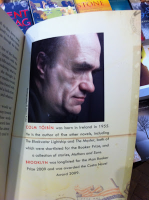
Here’s Colm Toibin looking moody and clever, with some very nicely written - albeit short - biographical notes. Great. Though I have to say I want to know more.

Likewise Nicole Krauss (sorry about the dodgy photo). Again, a really well written short biog to accompany it. But again, we could do with more.

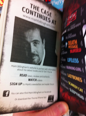
This Mark Billingham approach is more mass-market and straightforward, and it doesn’t tell you much about him at all, but it shows very clearly how you can sign up to find out more.

The long running 4th Estate PS sections at their best offer fantastic material with a reading group slant: good author Q&As, journalism and reading group notes. And yet when not at their best they can seem a bit mechanical; a bit of a box-ticking exercise.

Orion give us a more tailor-made approach at the end of the Zafon novels, and I think The Passage, too. There are grey edged pages, to differentiate them from the novel itself, and walking tours with specially taken photos. Very carefully judged material, very specific to the books.

But the best endmatter in my opinion is in children’s books. I sense a real focus in the best kids' publishing on the minute detail of the reading experience. They know that kids read their favourite books in an obsessive state of mind, and that they pore over every page, absorbing everything.


Hodder Children’s How To Train Your Dragon series

... and Puffin's Roald Dahl books show a desire to reward and engage with this kind of reader attention. Is there any reason for adults' books to be any different?

So we are doing some good work at the end of the book: we’re sometimes giving readers what they want. But should we be aiming higher?

After all, we expect an enormous amount from our covers. Perhaps we’re beginning to expect more from our blurbs. We should realise that what we print inside can play a vital role in our communication with the reader too.

I think we should aim - and I acknowledge this can’t be done on all books - for bespoke, finely judged interventions. Messages that suit both the book and the mental and emotional state we’re expecting the reader to be in, and which direct the reader to take action in a way which helps us. Put crudely, we want to invite them to turn their enjoyment of finishing this book into the desire to buy another one. But not by simply by saying “buy another one”.

I’d like to end by proposing two important concepts, which can help us take a happy reader along the path to another purchase, rather than clonking them over the head with the marketing stick:

1. Action

If you strike just the right note, and turn your reader’s enthusiasm for the book they’ve just finished into some kind of action, any kind of action, then you’ve sealed their enthusiasm for it and made it more likely that they’ll react well next time they have an opportunity to buy. Essentially, you’ll be making them more loyal to your author.

To illustrate this, here’s something I’m proud of from the back of James Frey’s A Million Little Pieces.

It doesn’t say “Buy the next one!!”, it says “have your say”. Readers will have an opinion about this book and the debate that surrounds it. We invite them to express it. To date, several thousand of them have. They’ve taken action and gone on record as people with an opinion about James Frey. I don’t know for a scientific fact, but I strongly suspect that makes them more likely to read another one of his books.

In the back of How to Train Your Dragon, it says “draw your own dragon in this box, and send it in”. Perfect.

I would argue that inspiring action should take a higher priority than simply providing content.

So, rather than: “here are your reading group notes” you might have: “go to this Facebook page to find out what reading groups thought about this book, and tell them what you thought”. Though clearly we need to find a balance between inspiring action with giving readers what they want.

2. Advocacy

… which is related, but different. It’s the familiar idea that readers sell books to readers. Anything we can do to take an enthusiastic reader, who’s just finished a book and is feeling all energetic about it, and help them tell their friends about it will be immensely valuable.

How? Don’t know. Perhaps it’s something dead simple like “Did you love this book? Email us and we’ll send you a pack of postcards so you can tell your friends why”. Or: “tweet what you thought of this book with our hashtag; the author will follow you, and you could win some free copies to give away”. Depends on the audience.

Actually, on the hashtag topic, there’s a recent Dare 2 Comment blog about publishers creating “official hashtags” to organise readers' discussions about books on social media. Putting that at the front and the back of a book is a great idea.

So what I’d really like to close with is this: the end of the book is a special moment, and a huge opportunity for binding in readers. It deserves proper thought, and sensitive handling. Organisationally, that’s an absolute gyp. A huge effort. But then so's everything worthwhile. Just look at book covers. I’d encourage publishers to pick out even just one book you really love this autumn and really go to work on what you want the reader to experience, and what you want them to do when they finish it.

The end of the book is a direct-to-the-reader selling tool that is entirely within our control.

That has to be worth using well.

Wednesday 18 May 2011

Guest Post: Katie Kotting of The Unsamaritans Book Group

Book: Watching the English (Kate Fox)

Date: Thursday 12th May 2011

Venue: Clare C’s lovely new pad by candlelight

Attendees: Clare C, Clare S, Frances, Geoffrey, James S, James M, Jo, Katie

There tends to be a bit of scepticism in the group when we agree to read a non-fiction book – will anyone bother to read it? In this case, most of us had, if not all of it then at least enough. Watching the English is written by social anthropologist Kate Fox, an in depth study of average people, based primarily on observation, to try and uncover the hidden rules of being English.

For the most part, the book was well received, with one notable exception which we’ll get to later. James S, had enjoyed the book so much on first reading a couple of years ago he had brought it to the group’s attention. Frances, one of the few non-English members of the group present (interestingly neither of our Scottish members attended), noted that it helped her to see the bits of ‘Englishness’ that she had adopted over the years. Katie also found that reading about the characteristics that were suggested as quintessentially English helped her to differentiate between her English and German heritage. Clare C wondered whether some of the behaviours attributed to ‘Englishness’ were really ‘English’ or could they have been more universal?

There was much discussion about her comments regarding class – how did we feel about this? The general consensus was that her observations were interesting, astute and inoffensive as she was not judging or commenting on her findings, merely stating them.

Geoffrey, on the other hand, was thoroughly unimpressed with the book. He thought it was an overwritten 50 page loo-book/stocking-filler. He found it long-winded, self-indulgent and smug. There was a general agreement that perhaps the book could have been a bit shorter, but that many of the insights and nuances would have been lost or over-simplified in a stocking-filler version. Ultimately she is an academic and the book bears the hallmark of this.

As an in depth study of the rules of English behaviour it certainly resonated with us and we could all recount times when we had witnessed or displayed the behaviours that Kate Fox singled out as being common to English folk. So what was her conclusion about the essence of Englishness? If you’re keen to know I suggest you either follow her lead and spend the best part of ten years watching and listening to people’s conversations and interactions in pubs, busses, business meetings, tea-parties, work places and more, or take the easier option and read ‘Watching the English’.

Tuesday 12 April 2011

James Frey at Lutyens & Rubinstein

My scribbled notes from James Frey's first event promoting The Final Testament of the Holy Bible, at Lutyens and Rubenstein in Notting Hill.

1) The tiny downstairs of L&R converts into an event space when they part the bookcases and reveal their office space, complete with framed jacket artwork. Genius!

2) Someone brought a miniscule sausage dog which, distractingly, snored exactly like an old man, throughout.

3) James was influenced by Joseph Campbells's Hero With a Thousand Faces, which apparently shows the phases common to all messiah myths.

4) Quotes of the evening:

"Is it at all autobiographical?" - Felicity Rubinstein, tongue firmly in cheek.

"I would love it not to be read as a work of antagonism" - James Frey

"I thought, I want to do to somebody what that book (Tropic of Cancer) did to me" - James Frey on his influences

"I also wrote a book called The Wind Howls Ha!" - James Frey

Sunday 27 March 2011

Towpath Cricket

A friend introduced me to Towpath Cricket, invention of Times columnist Robert Crampton. This friend clearly mis-remembered it slightly, but in fact improved on the original.

Towpath Cricket (Oppenheimer Variation) is played thus: every pedestrian you overtake on a towpath scores you a run. Dogs are two, other cyclists four and a boat six. If you yourself are overtaken, you're out, lad.

My first erm match took place as I cycled to Barnes from Battersea with H, loyally clutching her toy lion Daddy Rara, in the seat on the back.

Our first innings was a scratchy 13, entirely composed of singles and twos, and brought to an end by a silver haired chap on a rusty hybrid. What can I say? I had luggage.

Our second innings was much more dashing. We started with a Sewagesque flourish, scoring a six off a small sailing boat tacking mid-stream, perhaps a degree off perpendicular and thus counting as an overtake. You have to make a few decisions about your rules in this game - stationary pedestrians for instance - but in this case, as with our subsequent boundary off a two year old on a Tweenies bike with stabilisers, I have to say, I'm all, like: read it in the book, pal; they all count.

Sadly, just as I was scoring freely on both sides of the wicket (Wandsworth Gardens) I was castled by a bloke on a Specialized that probably cost more than my car.

Back to the nets...


Tuesday 15 March 2011

Guest Post: Jamie d'Ath of The Unsamaritans Book Group

Book: Alone in Berlin (Hans Fallada)

Venue: Big Geoffrey's

Story of resistance in wartime Berlin by workers Otto and Anna Quangel, stirred into action after their only son is killed in military service. Stricken by grief and filled with anger, they take it upon themselves to write and distribute postcards denouncing the Nazi regime. They remain at large for over two years, leading Inspector Escherich and the Gestapo on a merry goose chase. Along the way Fallada introduces us to a dizzying array of characters, representing a varied cross-section of life in Berlin. Whether they be a doctor, lawyer, gambler, shopkeeper, factory worker, postwoman or actor, Nazism has affected everyone deeply and themes of fear, suspicion, self-preservation and redemption run through the book.

The story is based on the true account of Otto and Elise Hampel and was written by Fallada in 24 days in 1947. On reading the epilogue it is clear many of the themes running through the book directly correlate to Fellada's own life.

We had a pretty good discussion. Jd'A felt the book was a good read, with good characterisation though lost its way through the middle of the narrative, with a sense of rushed prose and an unrealistic badly thought through weaving of the story. He felt the epilogue was an important addition to the story and helped explain certain elements of the book.

SB, (so wishing your surname was Spackman for this exercise), really enjoyed the book. She loved the rich characterisation and the very real sense of what it must have been like to live under such a torturous regime. For Frances this was a second time around read. She loved it the first time, though second time round whilst still enjoying it, felt it read a little sloppily. Agreed with SB though in terms of the characterisation. CC and Claire really enjoyed the story and raised the point about decency and the importance of morally doing the right thing. SF felt the characterisation was a little too black and white, in that the "bad guys" really were evil and the "good guys" just a little too squeeky clean. A number countered, including our esteemed host, big G, who sought to show the multi-layering of characterisation throughout the book.

The general consensus was Alone in Berlin was an entertaining and thought provoking read although one universal criticism was levelled at the translation and the possibility of the text losing a lot of its original colour. The title in German is Everyone Dies Alone, which makes a great deal more sense.

After the chin stroking, wine sniffing and big G's ratatouille munching, we got down to the serious business of celebrating the colourful characters that make up our delightful group. There were three prizes up for grabs: MVP, LR, TT. The lasses were a little perturbed with the schoolboy nature of the ceremony but got stuck in to award the following:

MVP - Frances
LR - SF
TT - Jd'A/JM

After some pretty dire speeches, ok well just mine, we moved onto the more important open vote on best book and best discussion. The former seemed to be between "The Consolations of Philosophy" and "Knowledge of Angels". The latter was picked up by, "We Need To Talk About Kevin". Worst book was universally agreed to be "The Alchemist" (or anything JM had chosen).
Next time round it is "Watching the English", so bring it on...

Tuesday 1 March 2011

Sudbury, 1844.

I have a blurb-related pet hate:

"Palestine, 1941". "Leningrad, 1952". "England, 31st August 1939". "Vienna, 1939".

The opening sentences of the blurbs for Mornings in Jenin, The Betrayal, The Very Thought of You and Quiet Twin

On the paperback fiction table at Daunts on Fulham Road right now there are fifty two books. No fewer than twelve have blurbs starting either with this exact formulation - location, date - or featuring location and date somewhere in the first line. For example: "In 1901 a young frontiersman named Peter Force comes to New York City" "It is 1940, and bombs fall nightly on London" "On 19 August 1936 Hercules the boxer stands on the quayside at Coruña" "The year is 1878".

It's natural to want to set the scene, but surely we can come up with cleverer ways to do it? And is it really so important to get this information across first? Surely we can arouse a reader's curiosity better by beginning with something that's uniquely appealing about the book, letting the bare facts of its setting come later, or even not at all.

Friday 25 February 2011

How To Win Your Book Group


Don’t kid yourself. You didn’t really join so you could “share with likeminded readers”. You want to be the boss of the book group. Here’s how:

1) Props.

Everyone always brings a copy of the book. Why? To read from it during the evening? No, that would be lame (see point 5). No one really knows why they do it. They just do. So you have a living room containing ten middle-class folks and as many identical paperbacks. Make sure yours looks the best. NO, I don’t mean it’s been carefully covered in plastic like they do in the library. I mean it’s, well, a bit f***ed. It’s warped and stained. It has dogeared pages and contains a stack of notes, scrawled on random envelopes and receipts. It says “I read this in a fast fury of intellectual vigour; I consumed it hungrily and fiercely and I’ve devoured its every significance. Whereas you, feeble sap, barely broke the spine of yours. Thus I win.”

2) Notes.

You want a great wodge of them, stuffed in your book (see point 1, do keep up). Not neat and tidy, with words underlined, because that says “girls’ school sixth form” like nothing else. No, these notes are extensive and they are messy. They say “I read fast, I think fast, I write fast. You can’t read these notes ... and in fact neither can I. Deal with it”.

Crucially, however, you must not refer to these notes during the book group, let alone read them out. No. They are your secret weapon, and they only remain powerful as long as they are secret. They are to make your opponents think “Looks like he has some really clever s**t written down there. I wonder when he’s going to use it. Perhaps if I say “I just didn’t really sympathise with any of the characters” like I was planning to, he’ll unleash the scary notes on me. I’d better keep schtum”. Result: win.

3) Research.

It’s pretty simple: if you bring a printout of the author’s Wikipedia page, you lose. If you bring a printout of the publisher’s reading group notes, you lose. If instead you bring something like a critical text about a completely unrelated author and leave it just visible under your copy of the book (see point 1) you win.

4) Opinions.

You can get away without any real ones for quite a while, but eventually you need to front up with a view or two. The golden rule is that your opinion has to be unchallengeable. Try luring your opponents in by asking something like “you remember that lovely moment at the diner where Claude notices the colour of the formica?” … or whatever; a tiny invented detail. Even if you’ve made it up everyone will inevitably nod and go “hm”. Then you’ve got them. You can load that moment; freight it, as the academics like to say, with as much significance as you please, and no one can contradict you. “It both prefigures his fall from grace and stands metaphorically for the entropy affecting the whole psychogeography of the province, don’t you think?” Nod. “Hm”. Win.

5) Quoting from the text.

Is both boring and sort of cheating. So don’t do it, lest you un-win the whole thing.


There you go. Follow those simple steps and you will leave the rest of your book group looking like a special needs catch-up class, and victory will be yours